I recently learned about the Picture Superiority Effect (PSE) in Moonwalking with Einstein. It refers to the observation that you tend to remember images vastly better than words, and I do mean vastly.
To me and many others, applying this effect to studying vocabulary seems like an obvious and great idea. So I want to do just that. Reading research, I quickly found a steep gradient. While research on the pure PSE yields astonishing results, results of transferring PSE to vocabulary learning quickly mellow out into small effect sizes and ambivalent results.
See the following two examples illustrating this:
- Visual long-term memory has a massive storage capacity for object details showed people 2,500 images in rapid order — and afterward they could tell whether they’ve seen a given image before with 87 - 92% accuracy.
- Supporting visual and verbal learning preferences in a second-language multimedia learning environment on the other hand finds picture-based vocab learning to be barely superior, and only in certain conditions.
Quickly I got bored with papers describing ITS implementations from the eighties in extenso with other people trying to sell me memory coaching, so I decided to run a couple of barely scientific experiments on myself.
Description of the sole test subject
I’m currently trying to learn Egyptian Arabic, which turns out to be rather hard. In this context, I’ve already built several more or less ill-fated learning tools instead of just investing hours into actual studying 0 1 2. This is going to be another one.
To keep a patina of scientific-ness on this experiment with n = 1, here are a few facts about me that may interest you in the context of this experiment:
- I have some relevant previous knowledge, but not much. I may qualify for A1, barely. The average Egyptian world will be unfamiliar to me.
- However, I can read Arabic script fairly fluently.
- Since I’m actually trying to learn Egyptian, my Retention Intention should be fairly high, and this whole thing should feel somewhat less like a complete waste of time.
The plan
To set down what I want to do:
I want to improve the effectiveness of the initial exposure of a learning item by using the PSE. Learning foreign language words with pictures instead of pure written words, so to speak.
To this end, I want to build a small tool exposing me to Egyptian Arabic vocab in different ways, then test which way improves retention the most.
The sole test subject writes some software
In the context of this whole project, I ended up building three software mini-projects.
The data generator
- First, I found me a reasonably high-quality-looking dataset with 1145 Egyptian words, including translation (The Egyptian Arabic 7 dataset).
- Quick aside: Ankiweb datasets are for personal use only, and I am not allowed to re-share the data. Therefore, this whole project is currently not Open Source (since separating the data from the source code is a bit painful and renders the whole thing fairly useless). If you want to run this experiment yourself, message me and I’ll send you the “censored” project.
- Next, I used a Python script and the Unsplash API to download one related image per word, using the provided English translation as a search string.
This rather sloppy optimistic approach will cause a lot of problems later.
The presentation and testing app
To actually expose myself to the new-to-me vocab and then later test myself on it, I set up a small Vue app. It has two modes, presentation and test mode.
Presentation Mode
The point of the presentation mode is to expose me to each of the words for a short amount of time, kind of like in the aforementioned study. The plan is to expose me to every word exactly once, for five seconds. Then the next word would be shown.
Since this is an experiment, I set up different conditions:
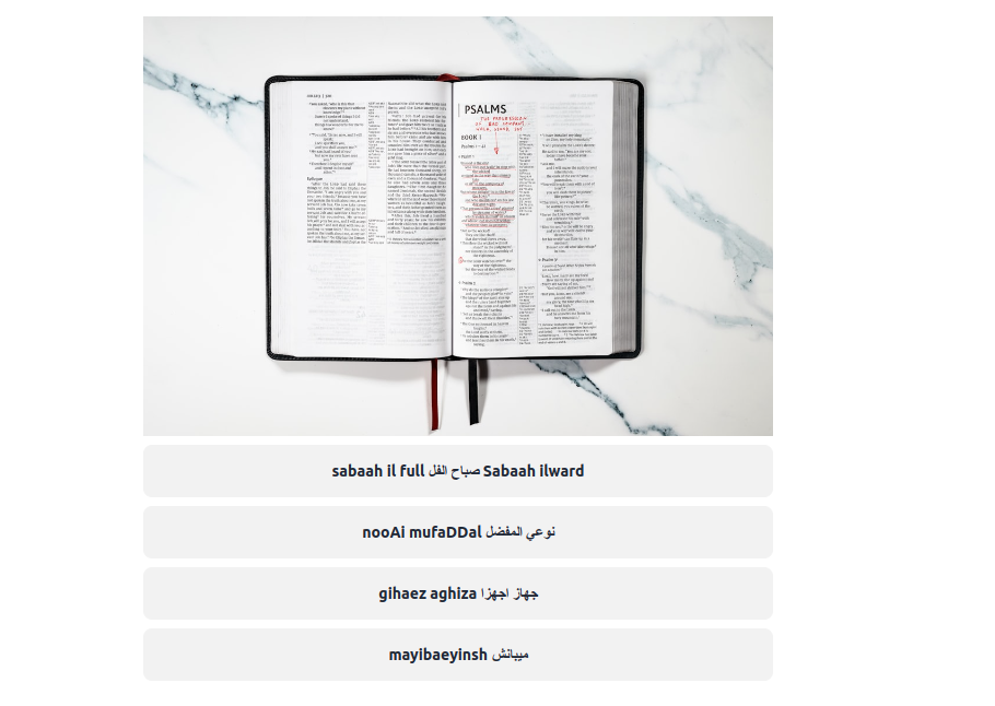
English, Egyptian and Image (🇬🇧 🇪🇬 🖼️)
Looks like this:

As you can see, this shows me all the data I have for a given word, all at once. Ideally, this would forever fuse the Egyptian word to the English one, anchored by the memorable image.
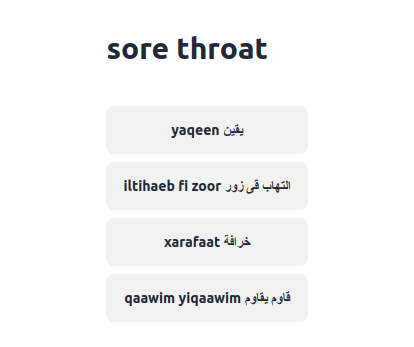
Egyptian and Image (🇪🇬 🖼️)
Looks like this:

Similar to the previous condition, but skips the English translation. I wanted to know whether a word can be learned by image alone so to speak. In a way, this may be the purest application of the PSE.
English and Egyptian (🇬🇧 🇪🇬)
Looks like this:

A kind of control group. This is essentially how you would study the words if you downloaded the dataset I found and used it as-is in Anki. I wanted to know whether the image conditions would beat this default learning mode.
Just the Image (🖼️)
Looks like this:

An even meaner control group. Seeing just the image is useless, and should not enhance my Egyptian knowledge in any way.
Would results for this presentation category turn out really well, it would probably mean that the dataset contained really easy words or that I had underestimated my Egyptian skills (unlikely).
In this light, this presentation style is here to validate that any of my other conditions is even doing anything.
Testing Mode
After seeing all the words once, I want to know how well I remember them. For this, I set up a testing mode. Each word would come up once (in a random order different from the presentation order), and my retention would be tested in a randomly selected condition. This part is self-paced by me, the test subject.
These were the different possible test conditions:
Seeing the Egyptian word, click the correct image (🇪🇬 → 🖼️)
Looks like this:

Seeing the image, click the correct Egyptian word (🖼️ → 🇪🇬)
Looks like this:
Like the above, but reversed.
Seeing the English word, click the correct Egyptian word (🇬🇧 → 🇪🇬)
Looks like this:
This is again kind of how you would practice (and test, given that Spaced Repetition uses the Testing Effect and all that) in Anki etc. when not using any images.
Data analysis scripts
At last, I wrote a couple of scripts in R that would take exported presentation and test data and run basic statistical analysis on it. The content is mostly uninteresting standard stuff generated by ChatGPT; I will talk about the results later.
The Execution
All this done, I put on my headphones, played FLYING OVER SWITZERLAND (4K UHD) - Relaxing Music With Stunning Beautiful Nature (4K Video Ultra HD) - YouTube at low volume and more or less intensely tried to retain the data that my Presentation Mode was showing me.
Overall, my scripts found an image they deemed fitting via the Unsplash API for 754 of the words, so this took a good hour.
After that, I got groceries, ate, cleaned my room, and watched some Jet Lag: The Game.
You may have been interested in a retention test directly after exposure, but since I’m interested in actually learning real-life Egyptian Arabic, I figured that testing retention after doing some real-life activities would be more interesting.
That out of the way, I tested myself on all 754 words in the Test Mode. This took me 48 minutes.
The Results
Already during the presentation, I noticed quite a few problems with my whole setup, so I’m going to start this chapter with some commentary I’m gonna pretentiously dub Qualitative Results.
Qualitative Results
Overall, the whole thing went fine. I wasn’t interrupted, and there were no major technical difficulties. Three words were presented but not tested for mysterious reasons, about half a dozen images turned out to be Unsplash’s placeholder image for image not found, and I got decently bored around two-thirds in.
However, I found rather large problems with the whole approach
Unsuited Images
Since I am both the conductor and the subject in this domestic lab, I tried to prevent exposure to both the words as well as the images of the “study”. Therefore, I didn’t notice that a lot of the images did not work too well as an anchor for a lot of the words.
In retrospect, here are the reasons for the problem of unsuited images:
- The dataset contained a lot of words for which you would be hard-pressed to find a matching, unambiguous image (e.g. “qualified person” or “aim/purpose”).
- The Unsplash search algorithm did not always pick reasonable results — although it’s very good. Its fuzzy, ostensibly AI-based search can return surprisingly good images even for abstract queries, but sometimes yields absurd interpretations for straightforward search terms. This was the randomly picked image for “shark” I got:
For extra amusement, notice the (presumably) auto-generated alt-tag for this image. A lesson in the importance and complexity of labeling.
Too many experiment conditions
If you multiply the number of presentation styles by the number of test styles, you get twelve.
That’s quite a lot. Combined with the aforementioned issues, this yielded quite a few strange interactions. Here is an unscientific table I sketched after running through both the presentation and the test, showing how I felt about the enjoyment and difficulty of the conditions:
| 🇪🇬 → 🖼️ | 🇬🇧 → 🇪🇬 | 🖼️ → 🇪🇬 | ||
|---|---|---|---|---|
| 🇬🇧 🇪🇬 🖼️ | :)) | :)) | :)) | :)) |
| 🇬🇧 🇪🇬 | ~ | :) | ~ | :) |
| 🇪🇬 🖼️ | ~ | ~ | :)) | ~ |
| 🖼️ | :( | :( | :( | :( |
| :)) | :) | :) |
The little wave (~) basically means a combination of conditions that could’ve been interesting but were largely ruined by the issues with the dataset. For example, if you first see a word as Egyptian + English (🇬🇧 🇪🇬), you’d have decent chances later to match the correct image to the Egyptian word (🇪🇬 → 🖼️). However, this works only if the image actually corresponds to the word in a meaningful way, which it often did not, as discussed above.
As a result, I ended up with a bunch of semi-useless, semi-control groups, some intended, some not. More often than not, test results would demonstrate not only whether a word was retained, but also how well the image matched and how much harder a given test was made by how well the image matched.
Quantitative Results
In any case, I did analyze the data. I coded every correct trial as a 1 and every incorrect trial as a 0 and analyzed which influence presentation and test categories had on the average result. Let’s start with descriptive statistics.
Means and so on
First of all, my random selection mechanism for presentation and test styles worked out pretty well. For example, combined condition groups are not exactly the same size, but all hover around n = 75. Not extremely elegant, but shouldn’t be statistically offensive.
Here are the standard measurements for the different presentation styles:
| Presentation Style | Result Mean | Result SD | Result SE |
|---|---|---|---|
| 🇬🇧 🇪🇬 🖼️ | 0.33663366 | 0.47373246 | 0.03333170 |
| 🇬🇧 🇪🇬 | 0.38378378 | 0.48762597 | 0.03585097 |
| 🇪🇬 🖼️ | 0.39800995 | 0.49070971 | 0.03461199 |
| 🖼️ | 0.31843575 | 0.46717633 | 0.03491840 |
…and for the test styles:
| Test Style | Result Mean | Result SD | Result SE |
|---|---|---|---|
| 🇪🇬 → 🖼️ | 0.29729730 | 0.45795344 | 0.02845584 |
| 🇬🇧 → 🇪🇬 | 0.47307692 | 0.50023754 | 0.03102342 |
| 🖼️ → 🇪🇬 | 0.30645161 | 0.46195184 | 0.02933397 |
First of all, note how the standard deviation is ginormous everywhere, with the 95% confidence interval basically always spanning the entire possible range from 0 to 1. This is likely the result of the problems described above, combined with the binary-coded outcome. Whatever the reason, it most certainly reduces all following interpretations in certainty and relevancy.
Apart from that, I got the following from the data, if anything:
- 🇬🇧 🇪🇬 and 🇪🇬 🖼️ are the most effective presentation modes, with the condition showing everything at once (🇬🇧 🇪🇬 🖼️) being almost as ineffective as the control group (🖼️), both of which are not much better than random chance (every trial includes four options with exactly one being correct, so random clicking has an expected mean of 0.25).
- It’s interesting that 🇬🇧 🇪🇬 🖼️ is working so badly — it could be due to an overwhelming amount of information (or, again, a statistical fluke).
- The standard 🇬🇧 → 🇪🇬 test is apparently “easier” than the other two, which both hover just a bit above random chance.
I also calculated the same values for all twelve condition interactions, but since it’s all the same gigantic standard deviations, I’ll omit it here.
Chi-squared
Interestingly, running a Chi-squared test found significant group differences for the condition combinations in regards to test results:
| X-sqared | df | p-value |
|---|---|---|
| 32.365 | 11 | 0.0006664 |
…and the residuals:
| Combined Condition | Trial Incorrect | Trial Correct |
|---|---|---|
| 🇬🇧 🇪🇬—🇪🇬 → 🖼️ | 0.9123393 | -1.2168656 |
| 🇬🇧 🇪🇬 × 🇬🇧 → 🇪🇬 | -2.2736746 | 3.0325956 |
| 🇬🇧 🇪🇬 × 🖼️ → 🇪🇬 | 0.7922044 | -1.0566313 |
| 🖼️🇪🇬 × 🇪🇬 → 🖼️ | 0.4284448 | -0.5714538 |
| 🖼️🇪🇬 × 🇬🇧→ 🇪🇬 | -1.4656121 | 1.9548132 |
| 🖼️🇪🇬 × 🖼️→ 🇪🇬 | -0.1251663 | 0.1669451 |
| 🖼️🇬🇧 🇪🇬 × 🇪🇬 → 🖼️ | 0.7707064 | -1.0279576 |
| 🖼️🇬🇧 🇪🇬 × 🇬🇧→ 🇪🇬 | -0.2319932 | 0.3094293 |
| 🖼️🇬🇧 🇪🇬 × 🖼️→ 🇪🇬 | 0.1520982 | -0.2028665 |
| 🖼️ × 🇪🇬 → 🖼️ | 0.4157004 | -0.5544554 |
| 🖼️ × 🇬🇧→ 🇪🇬 | -0.5407442 | 0.7212371 |
| 🖼️ × 🖼️→ 🇪🇬 | 1.2382677 | -1.6515844 |
- bold: significant at 95% confidence
Now, just a warning: I understand chi-squared even less than statistics in general, so if you’re already cringing at my analysis, it’s about to get worse.
That out of the way, what I’m getting from this is the following:
- Showing words as pure text, then testing them as pure text, comes out ahead (🇬🇧 🇪🇬 × 🇬🇧 → 🇪🇬)
- Now, since I’m running this whole thing unscientifically from my bedroom I’ve forgone to state any hypotheses, therefor this proves nothing.
- In all earnest, I think this does not prove text-based vocab learning superior — the result can be explained by the confusion of badly matched images being entirely removed from this image-free condition.
- An interesting tangent here: Having an image that doesn’t too obviously relate to a word may be helpful, because it forces deep encoding — however when the connection cannot be made even with hard thinking; we’re hitting Wozniak’s warning of don’t memorize without understanding instead
- Seeing first the Egyptian term and the image, then having to find the Egyptian term for the corresponding English translation (🖼️🇪🇬 × 🇬🇧→ 🇪🇬) also worked comparatively well.
- This is promising — again, apart from the statistical caveats, that may mean that you can indeed replace the dry bore of textual words with fun images and learn target language words this way
Lessons Learned, and the future
Well, this was not very conclusive. But I still like the PSE, and inshallah I will run further tests. Here is what I’m taking with me for the next run:
- Have way less experimental conditions.
- I’m not sure what I was thinking with this shotgun approach. Presumably, I expected the effect to be stronger, in which case maybe some of these conditions would be interesting to analyze instead of frustrating to go through.
- I think I’ll take my shaky results anyway and go with 🖼️🇪🇬 against the standard 🇬🇧 🇪🇬 next time. Have to start somewhere, after all.
- However, I am still interested in why 🖼️🇬🇧 🇪🇬 was so unconvincing. We’ll see what we can do about researching that.
- Simplify the statistics.
- Having just two conditions allows me to do things like t-tests, which are so much friendlier.
- I’d love to have a less coarse measure than the binary “is (not) correct” that I’ve been doing.
- Some kind of Likert scale like supermemo is using for grading would help here.
- On the other hand, I want to keep the evaluation objective; free of biased self-evaluation.
- Maybe the solution is multiple test runs.
- However, here i run into the problem of having to measure all kinds of things, interval timing, whether I have slept between trials, number of trials, …
- I could test a word in multiple contexts, e.g. by using concordances.
- Some kind of Likert scale like supermemo is using for grading would help here.
- Use better data.
- I want to use a set of words more appropriate for the method, like easy, concrete nouns
- To this end, I could even use an extremely narrow set, like zoo animals.
- I also want to find a method of excluding inappropriately matched images.
- I could use spot-sampling to at least validate that the average image is decently well-suited.
- Alternatively, I could introduce functionality within the presentation or testing mode to mark images deemed nonsensical in the context of a specific word.
- I want to use a set of words more appropriate for the method, like easy, concrete nouns
- What I want to do about the testing conditions is harder to answer. Having three of them didn’t help in many senses. Having said that, choosing the ideal test condition is less easy than just taking the most “promising” presentation style — after all, we want the test that most accurately reflects relevant learning, not the one with the highest retention rate. I have to think about what the most useful dimension to test is, and how to test it, keeping in mind point (3).
That’s it for now. If you spot any mistakes, kindly let me know. See you next time.