Welcome back to my journey of understanding signs. Part 1 Part 2
Look, while writing part 1 of this series, I found this paper on you-are-here maps. You know, these:
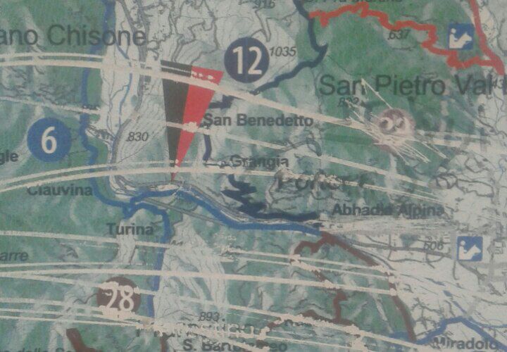
Example of a you-are-here map the author found on his phone. Just so you know what we are talking about.
Begrudgingly I thought, well, technically this is signage, so I guess I’ll put it on the reading list…well, it turned out to be a delightful read, packed with excellent, surprising and largely ignored recommendations for better you-are-here maps. Also on a higher level, it goes to show how easily UX can at times be improved, and at very little cost!
Recommendation #1, where we dodge some math
The first rule for better YAH maps happens to be rooted in math. I will give the mathematical idea real quick, in case you are quick with that stuff, and then we are going to make intuitive sense of it.
The two-point theorem states that to match two congruent figures (like a region in real life and a map of the same region) of which each is rotated and scaled by an unknown degree, one has to identify two pairs of corresponding points on both figures.
If you already see what this implies, feel free to skip this chapter. Otherwise, consider this task:
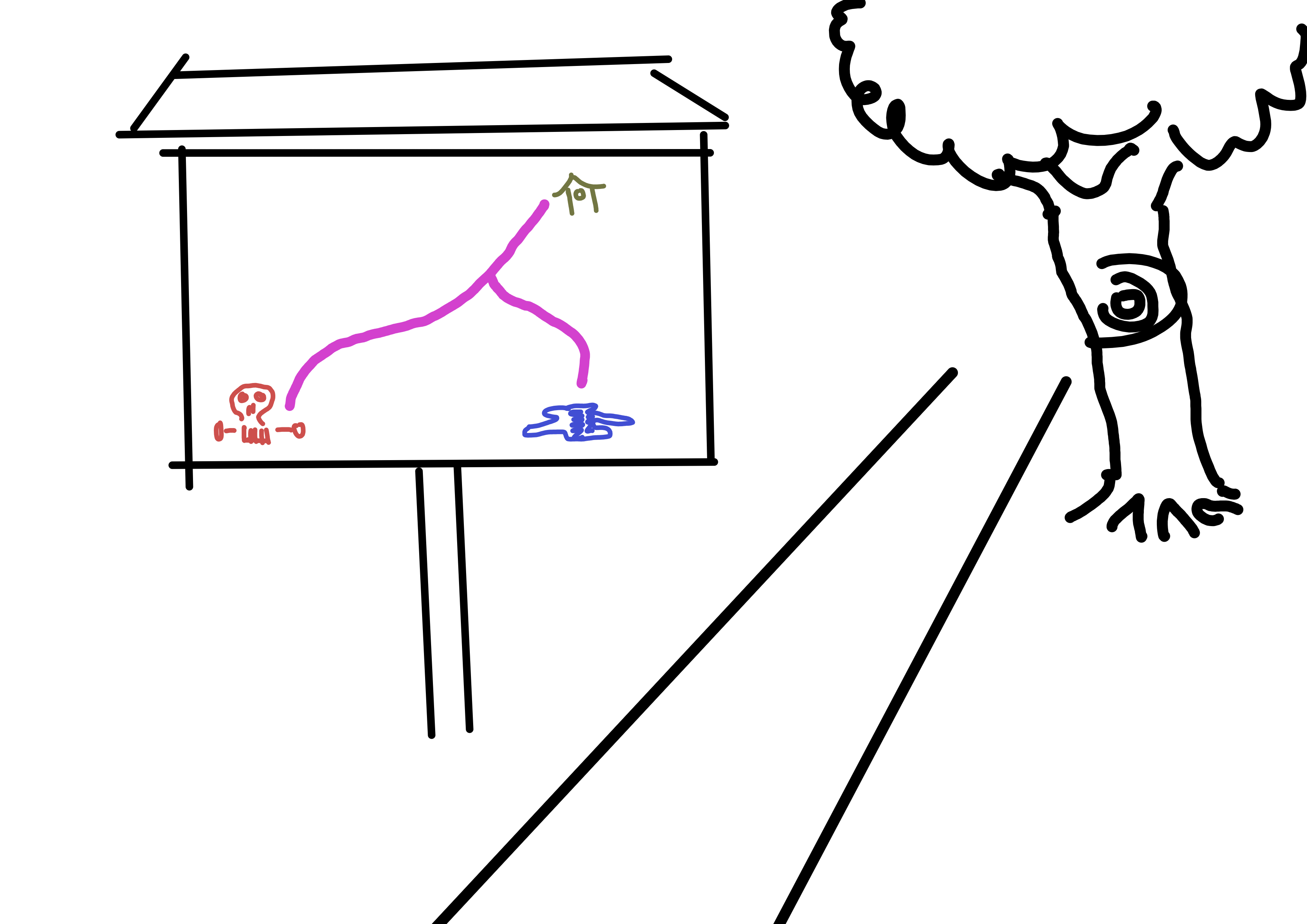
Find the house!
How would you find the house (presumably a shelter) with this map, while ideally avoiding the evil skull? Pretty hard, right? It’s a shitty map. Let’s make it a bit better:

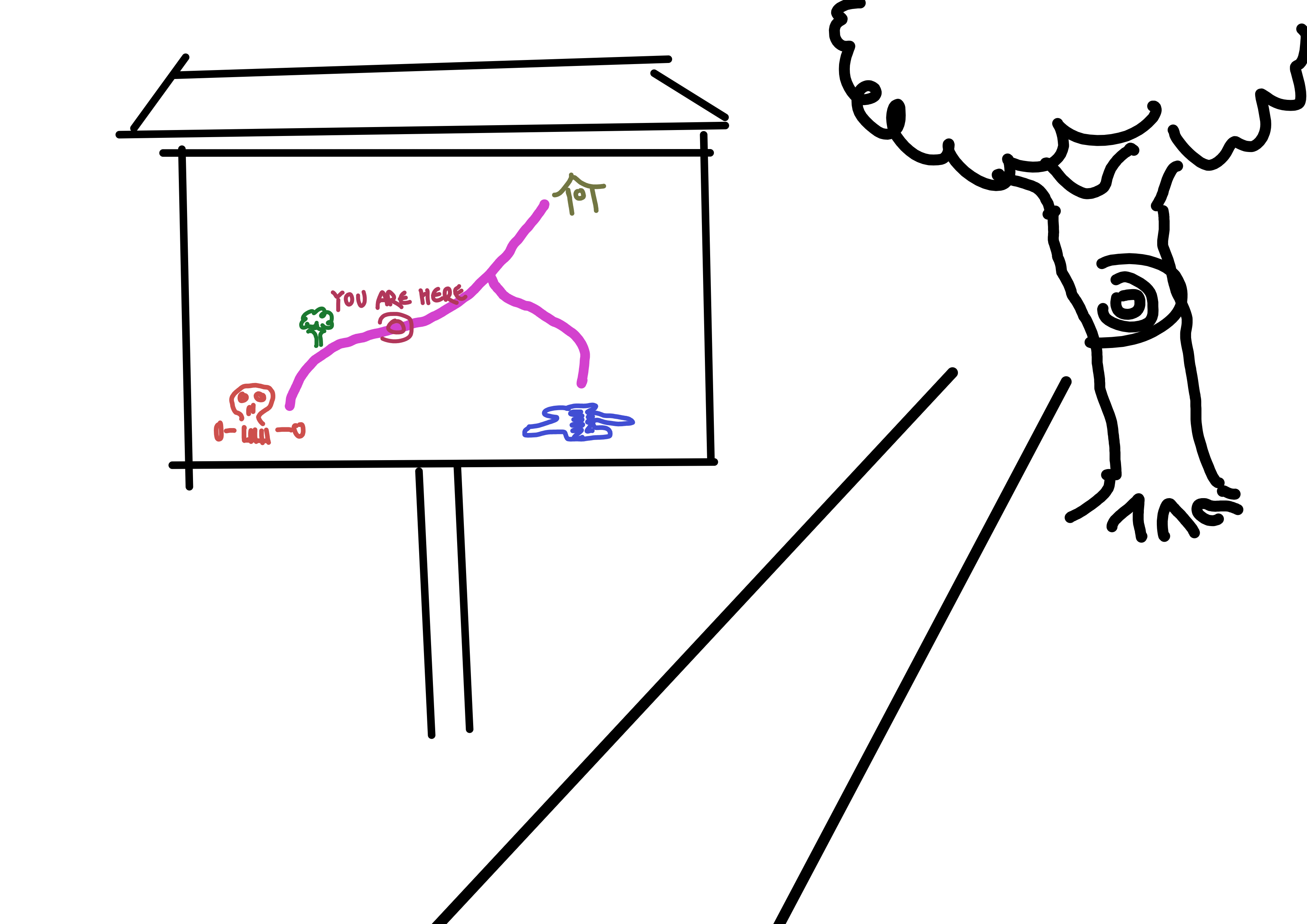
Your task is still to find the house.
Now it’s officially a YAH map. You know where you are, that’s cool. Not too close to the skull, phew. But you still want to get to shelter. Is it in front of you or behind you? You can’t know! That’s a bit scary, so let’s make the map a bit better:
Can you find the house now?
We got a tree now. Did you figure out in which direction the shelter is?
(Solution: behind you).
Your thought process might have been something like “well, not in the direction of the tree, so the other” or “Ok I have the map and the house, so let’s mentally rotate the map until it matches” or something else. This rotating-in-my-head might have been a bit hard still (we are going to talk about that later), but the point is that the task is possible for the first time. What changed?
The change was that we now have two points we can identify on the map and in real life. And, even more cool: Two points is always enough! With a YAH map, you get one point for free (the YAH marker itself), but you still need one more for the map to be useful (of course, more points don’t hurt - the tree might fall over after all).
That’s the first rule.
Recommendation #2, where we consider a problem with the first one
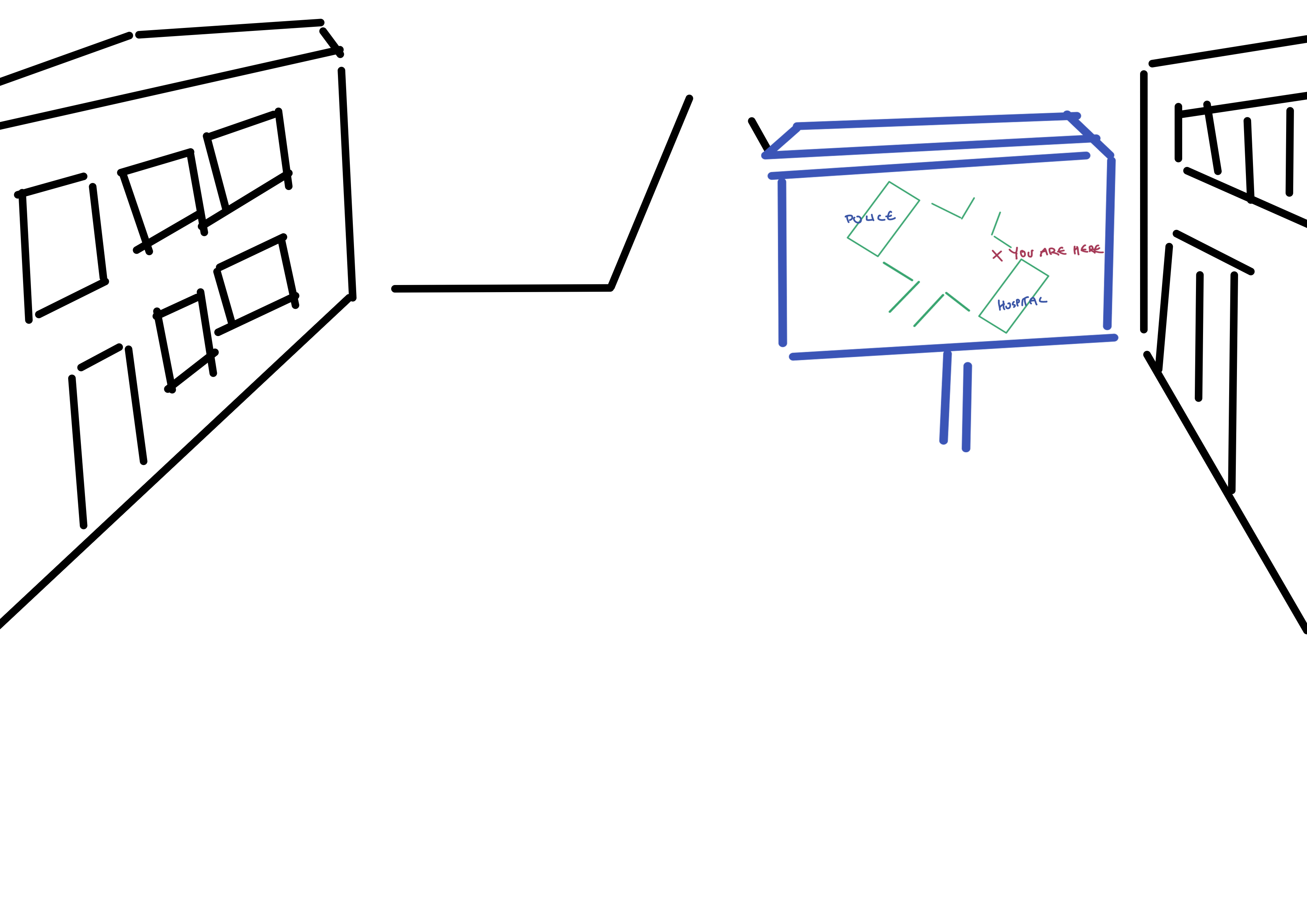
Let’s leave nature for a second and turn to urban life, where your YAH map also may live. Look at this one.
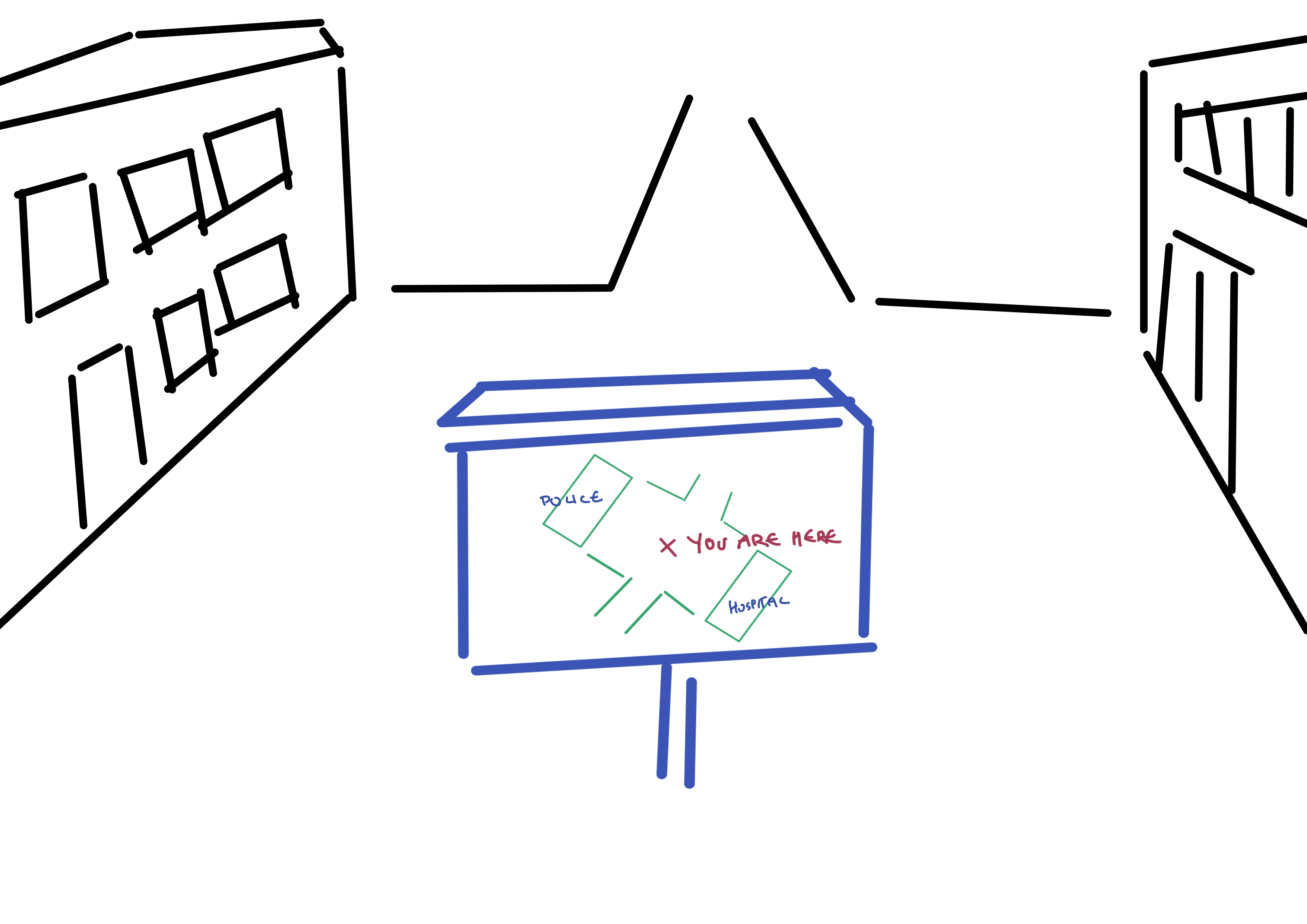
Oh no, you cut your finger! Where is the nearest hospital?
Chances are you may be a bit unsure which building is which. But why? Technically we are passing the test of having enough identifiable points with flying colors - we got the marker and two more buildings!
The problem is symmetry.
Now we could design our city center a bit more organically, have cute winding streets and all that. But that may be stretching the budget, so how about this:
Oh look, already there!
Suddenly, it is real easy to understand which building is which! The second rule is:
Use asymmetrical placement.
You may be saying that in real life the hospital would be probably labeled anyways and would not be the same shape as other buildings and so on - you are right. However, if you design maps for indoors, you are going to find a lot of corridors and rooms perfectly symmetrical, of the same size and mostly unmarked. So don’t underestimate the power of this recommendation
Recommendation #3, where we get really lazy with the first one
Let’s look at a real-world example of a map again just to appreciate how fiddly and complex they often are and have to be:
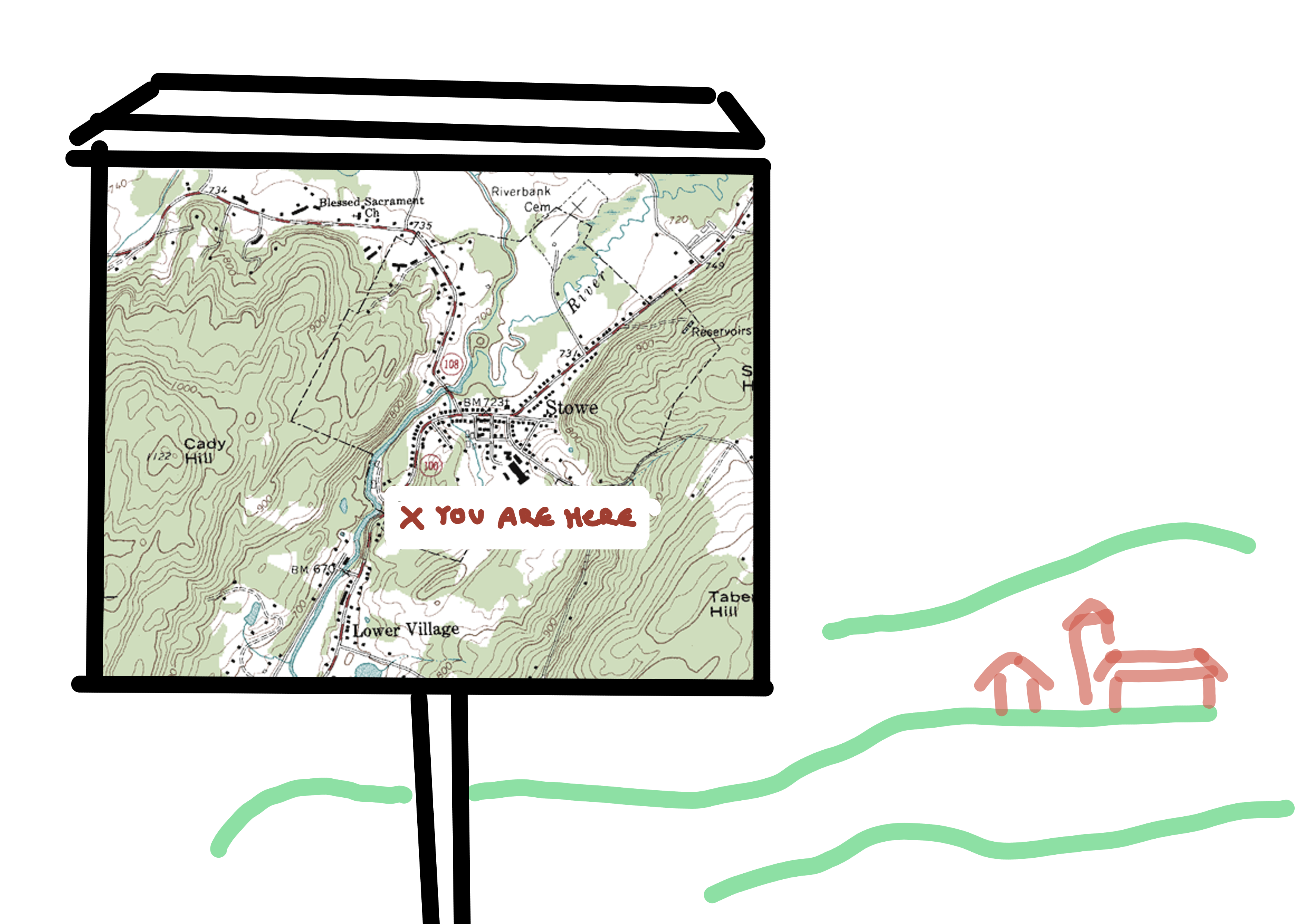
You are somewhere in Canada and want to visit your friend in Stewe
Imagine being somewhat lost and trying to rebuild a general mental map in your head. You found a map, nice!
Now you have these two buildings in the distance…are they part of Lower Village (great name btw) or Stewe? If you are actually in this situation, you probably have a decent chance of finding this out: One is a church, that must have special icon…the map is probably North-up, so if you can get the position of the sun…how are the hills matching the topography lines…and so on.
But this is a fairly high-risk calculation! Because if you get it wrong and identify the wrong village, then you are about to be truly lost.
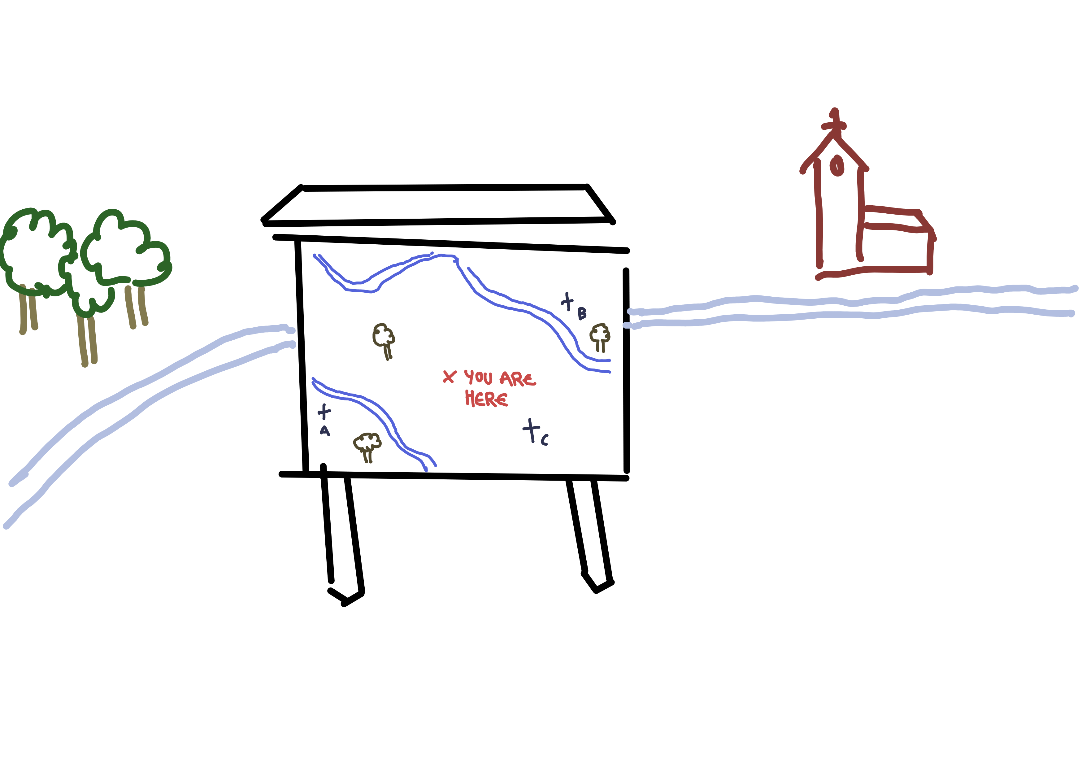
So let’s do the thing that may just be the coolest idea of the whole paper:

Look, it’s you!
No doubt, you must be looking towards the outskirts of Lower Village!
Solidly installed maps (as in, not pocket maps) have this practical feature that they can only be used from one defined direction - thus, if you make a little icon showing the user and the map, there is no ambiguity left!
The third idea is to make the YAH marker a manikin looking at the map, correctly rotated.
The iconography here is not trivial - drawing something that clearly resembles a person from above and the map was a challenge and I am not super happy with my sketch, either. Maybe there is some innovation to be done (or I should practice drawing).
However, I think this idea is super solid and should be used, like, everywhere (never seen it though, personally).
Let’s really bring it home.
Recommendation #4, where we get out the big tools
Let’s start with the example:
Which church are you looking at?
This map is at least somewhat asymmetrically placed and has a couple of points for identification - so then, which church are we seeing, A, B or C?
There is one correct solution - try to figure it out and describe what you had to do to find it. Then we are going to make it real easy:
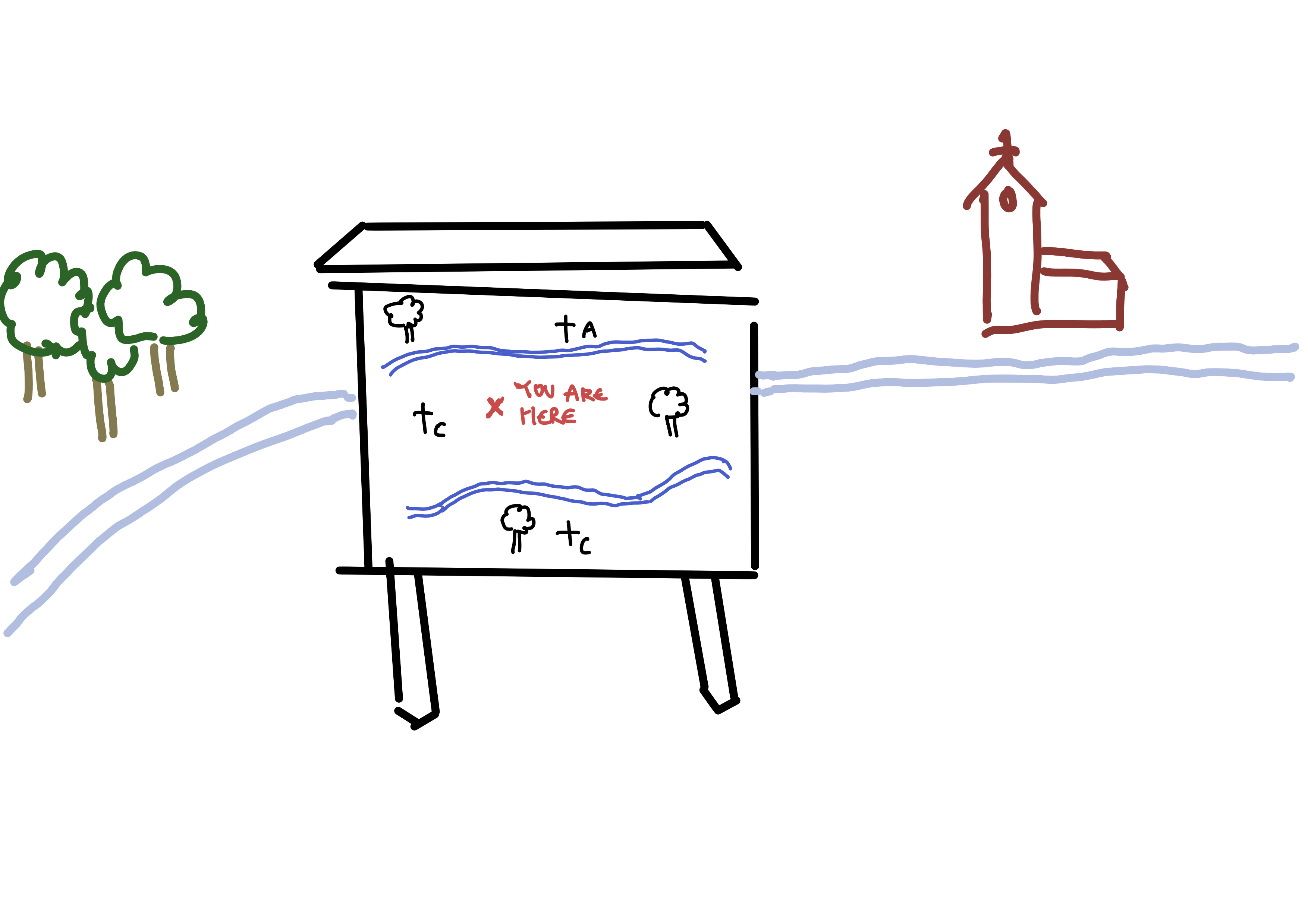
Yep, church A
What makes this map so much more painless is rule four:
Align the map with the view, so that the top of the map shows what is in front.
North-up is an important standardization for serious navigation, but since most people don’t have a compass on them, it may not be very useful for your map of an office complex.
Also note how this perspective is how most people use Google Maps or similar apps on their phones, with what they are seeing in front being on top of the screen! In a way, the author predicted the ease of this alignment 40 years ago.
Note how you have two opportunities to achieve this: When designing the map, and when placing it.
The first requires careful planning, the second one might require a big drill. Pick your poison. And don’t only consider free-standing hiking maps in national parks - the same principle applies when choosing a wall to hang a floor plan.
Summary
Let’s recap all these recommendations for you-are-here maps:
- Provide at least two well labeled points on the map that can be identified easily in real life.
- Place the map in an asymmetrical part of the terrain
- Make the YAH sign 800% better by drawing a figure looking at a map, rotated as to match real life usage
- Have the view in front of the viewer be “up” on the map
And there is another one. You were probably annoyed at me for showing you all these rules only to break them on the very next example. Rest assured, that was only for demonstration purposes and the last recommendation is to use all of the four ideas together, creating redundancy and awesomeness.
Thank you M. Levine for writing this awesome paper forty years ago - let’s create some better maps!
Thanks for reading! This post is part of my series of reading and summarizing papers, mostly relating to UX. I use a casual tone because that’s the most fun to me. That means my interpretation of a given paper may be off. Or incomplete. Or plain wrong. Always think for yourself, and for the love of God, don’t cite this in an academic context. Use the original article instead. Cheers!