Did you ever actually user test a color scheme? I didn’t.
While the UX designer of today prides themselves for their research-based, user-first approach, there is still a certain tendency to just assume what’s right for at least some things. Typography, layout. Color.
This is not wrong, as such. After all the role of a designer is to know these things. Still, I was recently reading an old paper about color preference in the web: The impact of colour on Website appeal and users’ cognitive processes (2010) and well, I got reminded that designers don’t alway know. Let me elaborate.
In summary, they colored web pages in a bunch of different colors and measured the reaction of laypeople and web designers.
Now in their experiment, each page had basically just one color, used with different lightness values for gradients, borders, boxes, cards and background. With this setup, they just tinted the whole site in different hues, like it was washed together with a new dress.
I am not a big fan of this methodology; it allows for a very clean manipulation of color and it is ok for 2010’s web design, but sadly it hasn’t aged too well.
Anyways, to the interesting part: They also measures the difference in preference of web designers and users. And look at that, there is quite some difference here:
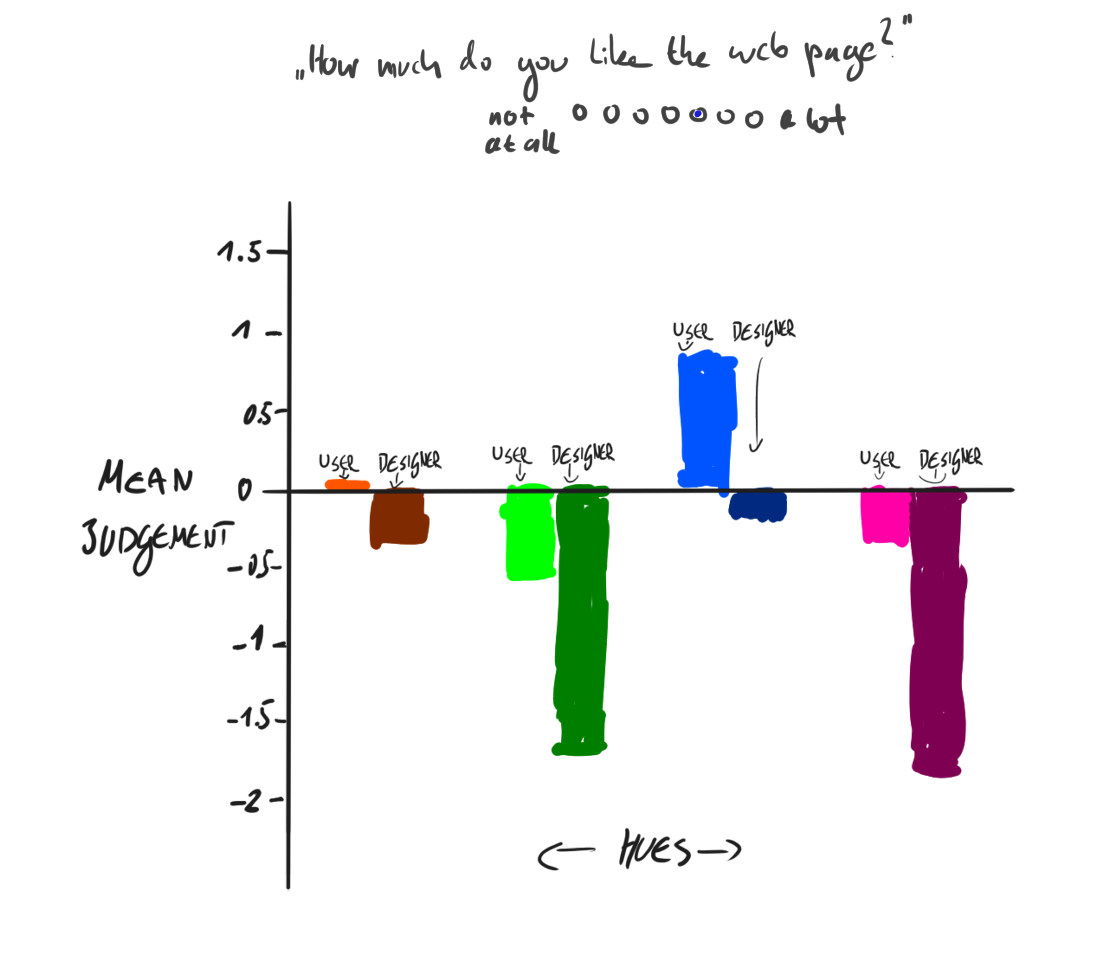
Partly recreated plot from the paper. People like blue, designers don’t. At least it’s not purple.
So more blue, avoid purple, embrace orange? No, that is not the point here. The paper has aged quite a lot, while the web and design language has evolved quite explosively. So I don’t think this plot is telling us much about color design anymore.
It does however tell us about a very dangerous bias: Designer taste is not necessarily the same as the taste of the people they design for. Now, I know. Sometimes aesthetics is not what matters. Sometimes people say one thing in a survey and then do something different in the real world. Sometimes the product and target group is so specific that generic advice about color theory is useless. That’s not the point. Still, I do like to keep this paper around as reminder.
Because while this paper is already halfway to legal drinking age, it still tells me: Check your assumptions at the door.
Thanks for reading! This post is part of my series of reading and summarizing papers, mostly relating to UX. I use a casual tone because that’s the most fun to me. That means my interpretation of a given paper may be off. Or incomplete. Or plain wrong. Always think for yourself, and for the love of God, don’t cite this in an academic context. Use the original article instead. Cheers!