I am currently on a mission to understand how signage works and, equally important, how it doesn’t work. Signage in general, I mean - road signs, wayfinding signs, warning signs, wall-posted manuals, whatever.
Maybe you are interested in following this journey of mine. We start by assuming nothing and knowing even less. Next up, we select some random starting point in the theoretical literature with the hope to get our mental model of this whole sign thing up and running. Strap in.
So to dive in, I just got some paper off the wide web: Effects of Signage and Floor Plan Configuration on Wayfinding Accuracy. It turned out to be a good pick. Here is what I got from it.
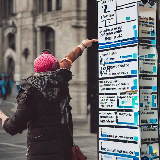
Thanks StableDiffusion, that’s actually perfect.
Floor plan dominates
This specific paper is about wayfinding signage in buildings. Fair enough, that is actually one part I am very interested in.
What the author points out again and again is that the most important factor as to whether people get confused, lost or slowed down is the floor plan layout.
Not only do very simple floor plans banish signage to the realm of obsolescence, very complex floor plans confuse people no matter what signage is used.
There is actually a nice general lesson in here: Don’t get so hyperfocused on what you are currently doing (signage), think about what larger factors are at play. In this case it turns out that talking to the architect real early is a way better idea than fancy sign design.
Hey, further reading!
As I remarked, I am quite at the beginning of my journey to understand the world of signs. So I am quite grateful for the reading inspiration this paper provided me with:
- Weisman (1981) discusses the four things people use for navigating buildings: landmarks, architectural differentiation, signage and plan configuration.
- Best (1970) brings up the idea of choice points, points on which you have to make a decision what to do. Simple, but honestly quite a powerful idea; more choice points = more potential confusing.
- Levine (1982) with some stuff on you-are-here maps.
- Bryan (1982) on how only 8% of people rely on fire exit signs when fleeing fire. That sounds not so good.
Into the reading list you go.
Signs work, in general
Unsurprisingly, the study finds that signage in general (with a few caveats mentioned elsewhere in this summary) work, as in they decrease people’s time to arrive somewhere, wrong turns made and so on. Good to know.
For speed, use graphical signs. For accuracy, use text
The study finds that people walk faster in the presence of graphical signage (=arrows) than with textual signs or none at all. On the other hand, text signs (=’Turn Left Here’) reduce stuff like backtracking and wrong turns.
Quite fascinating, but I would like further validation on this, since I am not entirely convinced by the general validity of the research. See next section.
Real-world validity?
Rightfully, the author criticizes a lot of the cited studies for using very artificial laboratory setups for their tests, such as having participants rate renderings of buildings as opposed to them walking through them.
O’Neill’s research fixes that, but still: The method used is very artificial. Participants walk towards a predefined destination and all existing signs point towards it. Fair enough for such a test, but hardly how it would work in real life - when is there ever only signage for the target your are actually trying to get to? Also, the subtle psychological factors such as stress, nervosity or self-awareness one might experience when failing to find his gate at an airport (or whatever) might confound the findings quite a lot.
Maybe a few case studies of actually implemented building signage would be a good idea to read as well.
Thanks for reading! This post is part of my series of reading and summarizing papers, mostly relating to UX. I use a casual tone because that’s the most fun to me. That means my interpretation of a given paper may be off. Or incomplete. Or plain wrong. Always think for yourself, and for the love of God, don’t cite this in an academic context. Use the original article instead. Cheers!