Buckle up everybody, it’s time for some old school User Experience.
I have decided to read some of the foundational papers of my field, and today we are starting with Designing for Usability: Key Principles and What Designers Think.
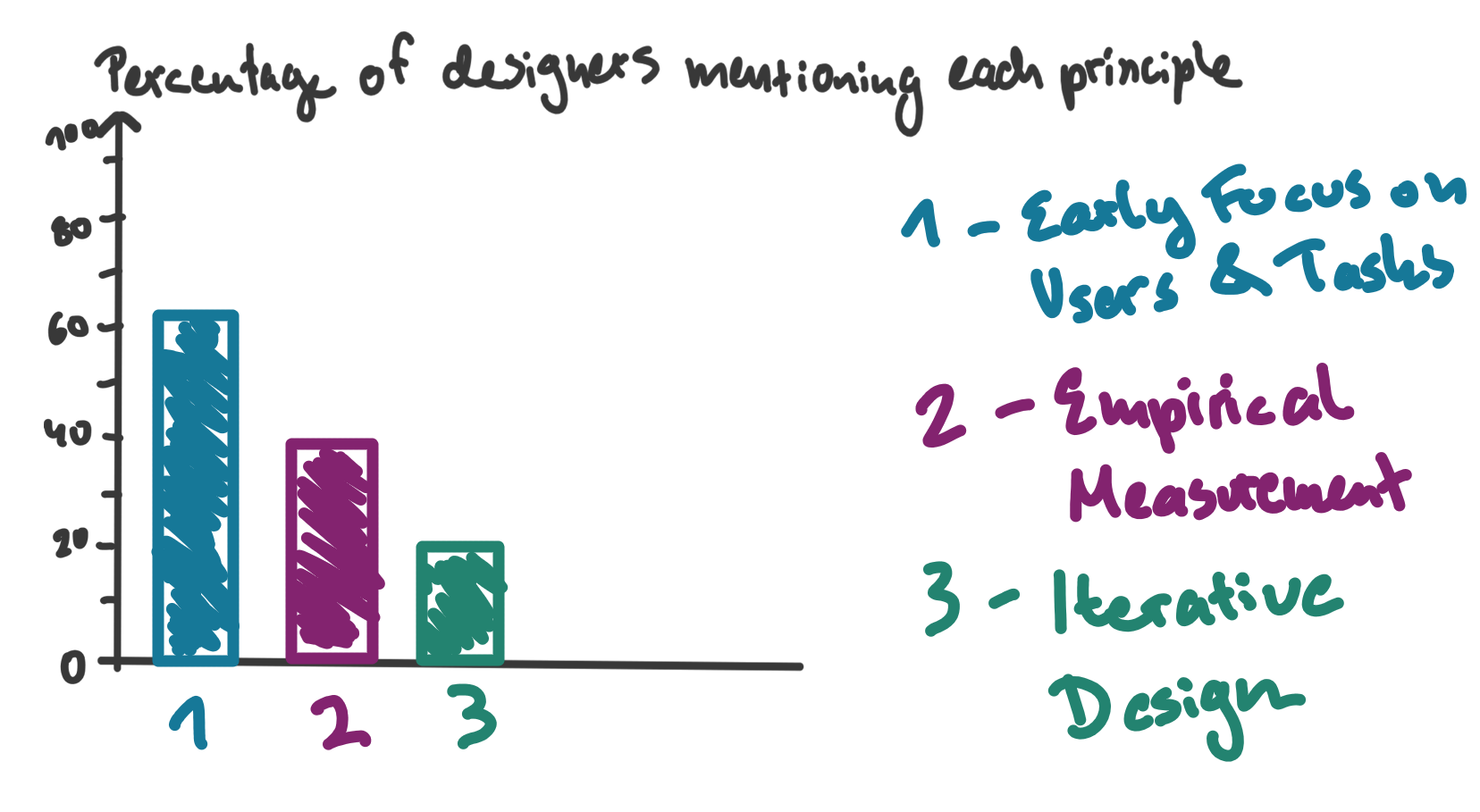
The authors loose no time. First, they lay out three principles they recommend you use when your job is to create systems that are easy to learn, useful and easy and pleasant to use:
- Early Focus on Users and Tasks, as in: Understand your user in all aspects, from cognition to attitude, and what they are trying to do.
- Empirical Measurement, as in: Use prototypes to simulate the real thing and observe!
- Iterative Design, as in: Problems you find while doing the thing above can’t just be dismissed, so you must improve your design step by step.
Now, today you might call these principles a tad self-evident. But that’s like calling out Taxi Driver for character clichés. They invented this stuff. Not only them, of course, but still, this was 1985! Since they mention iterative design, here is a comparison: The Agile Manifesto, arguably a big driver of today’s common way of cyclic working, would not be written for another sixteen years.

“That is so obvious!”
Ironically, the researchers encountered a very similar reaction even back then - people were like “cool, but kinda obvious, innit?”
So what Gould and Lewis did next was very cheeky: They found themselves another group of system planners, programmers, designers and so on and asked them to just freely describe their approach to developing computer systems.
This answer was then scrutinized as to whether it contained the three principles:
Oops
Even when interpreted generously, only sixteen percent of the answers included all three principles. And 26% mentioned none of them at all!
The authors are very careful to point out potential pitfalls of their method: What people say is not necessarily what people do, their principles are of course not an universal truth nor the only or best approach and so on.
Nonetheless, they rightfully point out that this might show that their principles are not so obvious after all. To the end of filling this gap, they offer specific clarifications and recommendations, such as:
- To gain early focus on users, aim for understanding instead of just identifying or stereotyping users.
- Direct contact is key.
- Consistent working together with users is recommended over just having users “sign off”.
- Be aware of the difference between user test and system test and do both.
- Do usability tests, not sales pitches.
- Have a process to actually incorporate learnings from user behavior into the building process instead of setting vague goals such as “should be user-friendly”.
Sound advice, I would say. I am not sure there is a single one that wouldn’t be worth putting on a sticky-note.

Thanks Stable Diffusion for this interesting image of a user interview.
Very much enacting what they preach, the authors also offer several theories as to why people did not mention the three principles in their descriptions:
- Designers might know and understand the principles, but question their worth.
- They might also confuse similar (but different) ideas.
- People might also estimate users as to be too similar or too different to be worth engaging with.
- In a similar vain, researchers might question whether users even know what they need.
- The belief that common sense, good tech and/or design guidelines suffice for good design might be another cause.
- Also, user research might be considered unnecessary fine-tuning or a general waste of time.
- At last, people might believe in the idea of “getting it right the first time”
I got to say, a lot of these are strangely reminiscent of resistance the UX designer of today might face. Amazing.
At this point, we are not even halfway through the paper. I think I am going to savor the rest for another blog post, since I am already amazed by the sheer quality and density of what was presented so far. Despite being released just one year after the first Macintosh, the paper offers amazingly timeless bits of advice. It’s also a case study of how to basically tell people that they are doing their shit wrong without being an ass about it.
The three principles are going into my UX learning flash cards, and the paper into my all-time favorites directory.
You will find part 2 right here once it exists.
Thanks for reading! This post is part of my series of reading and summarizing papers, mostly relating to UX. I use a casual tone because that’s the most fun to me. That means my interpretation of a given paper may be off. Or incomplete. Or plain wrong. Always think for yourself, and please, don’t cite this in an academic context. Use the original article instead. Cheers!