Microwave oven interfaces. Confusing, arbitrary.
Font sizes so tiny that even Herman Snellen would disapprove, icons so weird that Jean-Francois Champollion might have been interested. A banal process - heating food - elevated to an art form nobody asked for, to the point where it is general wisdom that other people’s microwaves are but impossible to use and Wikipedia describes the awkwardness of microwave oven interfaces as an often employed example of interface design.
Well, not with my microwave. Let me show you my microwave:
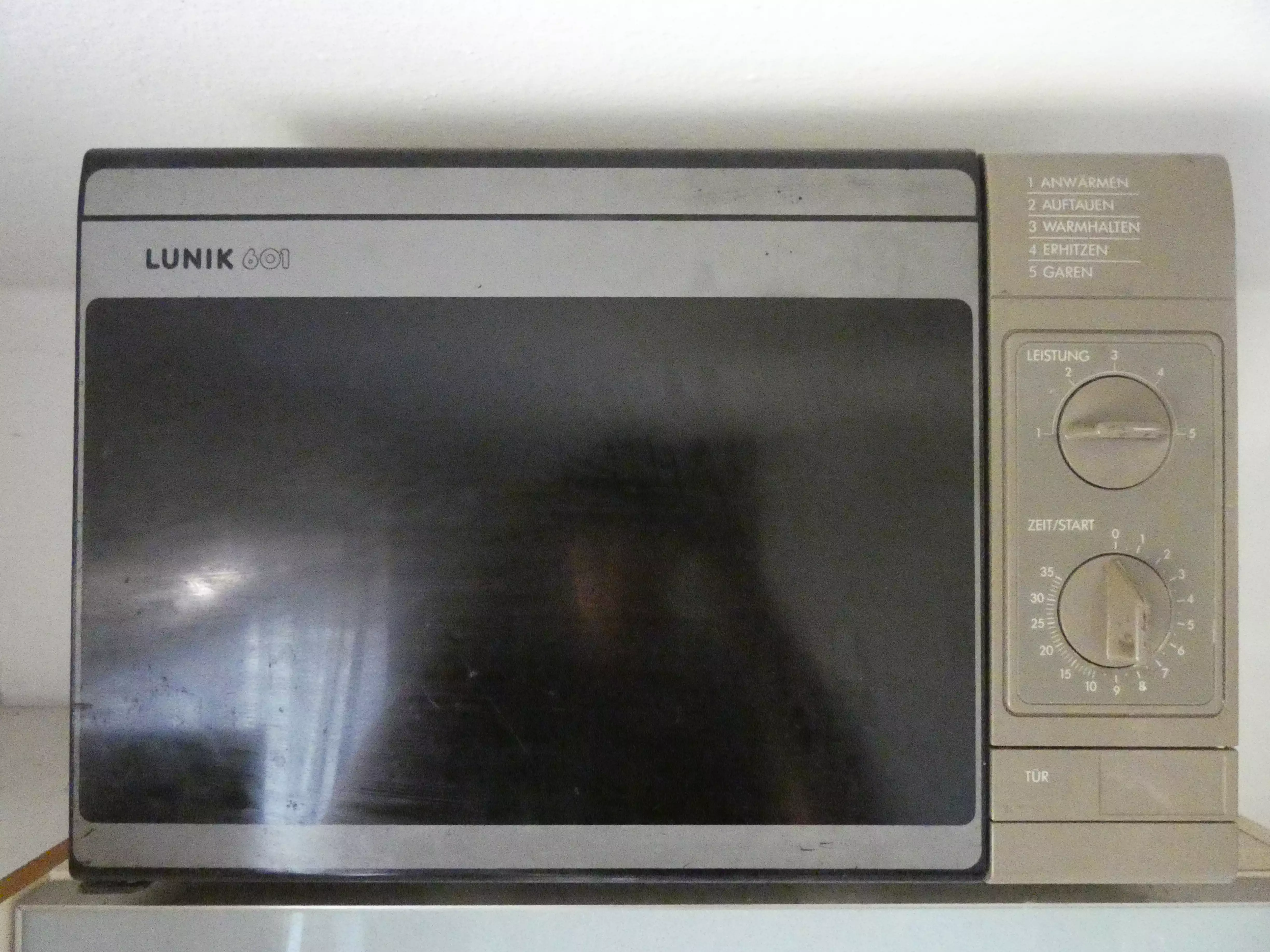
Hell yeah!
As you are going to see (or know, if you got a similar one) this microwave oven is most pleasant to use. But first, let’s attempt to give this article some kind of direction.
You see, for years this microwave was the only one I really interacted with. I was innocent, shielded from the terrible state of the art like someone who never pried open an old electronic device to peek at the horrors of soldering work in an hypercapitalist Fast Tech world. Even then, I found this device pleasant to use - I just didn’t think much about it.
Become as articulate about describing excellence as you are about describing failure.
— Marcus Buckingham in First, Break All the Rules
As such, it would be easy to define my microwave oven as what it is not (absolute shit, that is). But to be honest, it shines by itself. So this article is not going to be a rant about modern microwave interfaces - we will only mention these monstrosities when comparableness demands it. Instead, we are going to talk about why the Lunik 601 design works well as a kitchen appliance, by itself, back whenever it was concocted as well as today.
A word about the Lunik 601
Very little is known about the elusive 601. No really, even though I would rate my ‘Internet Research’ ability fairly high on these little skill level scales that no one puts on their CV anymore, I can unearth very little about the model or even the company. It is probably German, and at least twenty years old. That’s it, sorry.
As much I would like to put this in some pretentious socio-economic context here, in the end it doesn’t really matter. About all microwaves of a certain (fairly long) era look like this, so take your pick. I am still going to be talking specifically about mine, though. It deserves it.
The high level
So, what makes my Lunik 601 great, then? Let’s start from a bird’s eye view and zoom in later. Don’t worry, we are going to get weirdly specific.
Great design takes a problem, and solves it.
Then it stops.
Great design is when nothing can be removed. This is that. Let me elaborate.
The interface
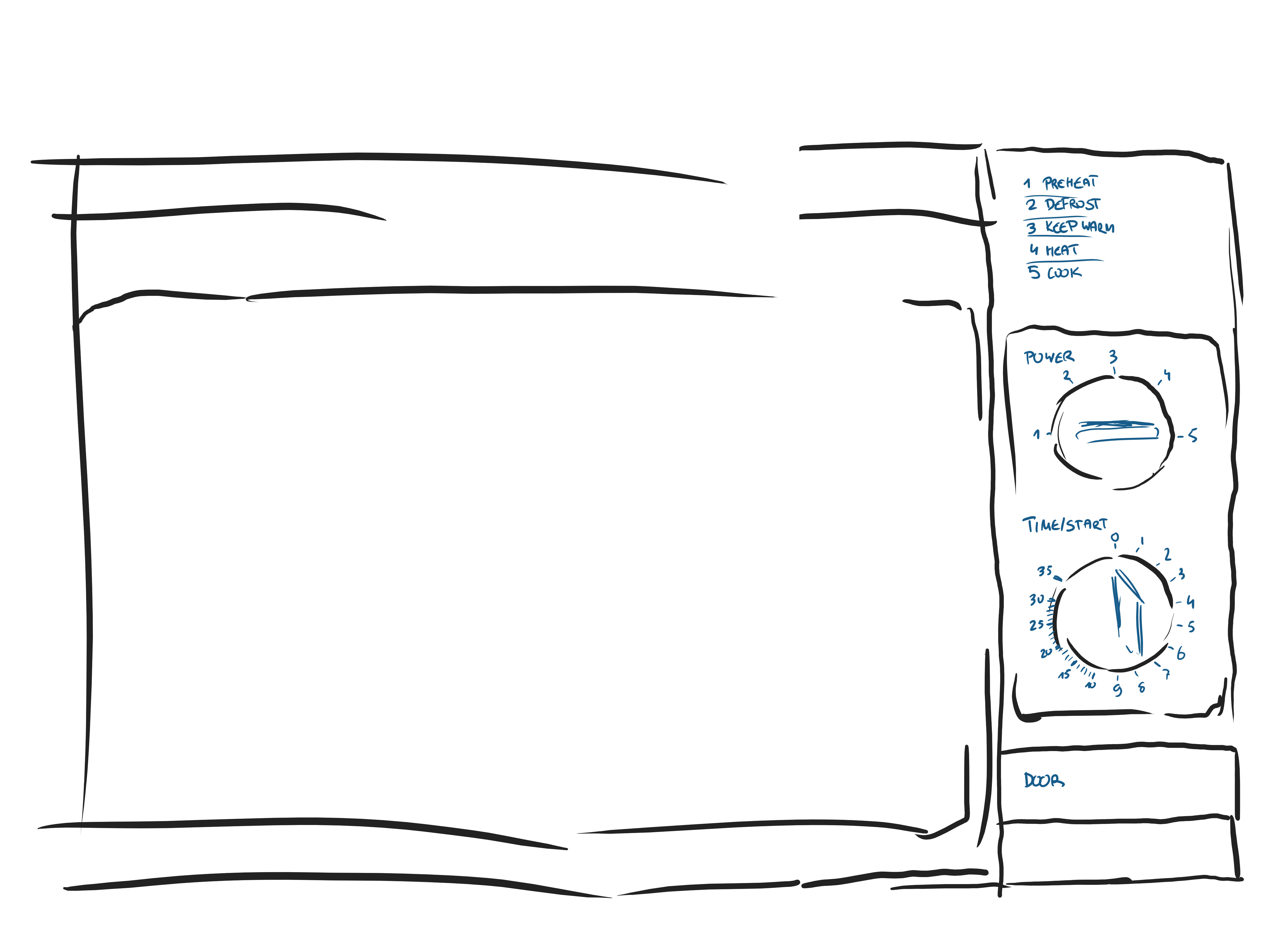
Translated the interface for you
Short descriptive intermezzo so we are all on the same page: What do we have, interaction-wise, to heat our food?
- Timer - a continuous dial
- Power setting - a discrete dial
- Open door - a fat, mechanical button
- Door - you have to close it, otherwise nothing happens
Let’s start with the dials.
Rotary knobs
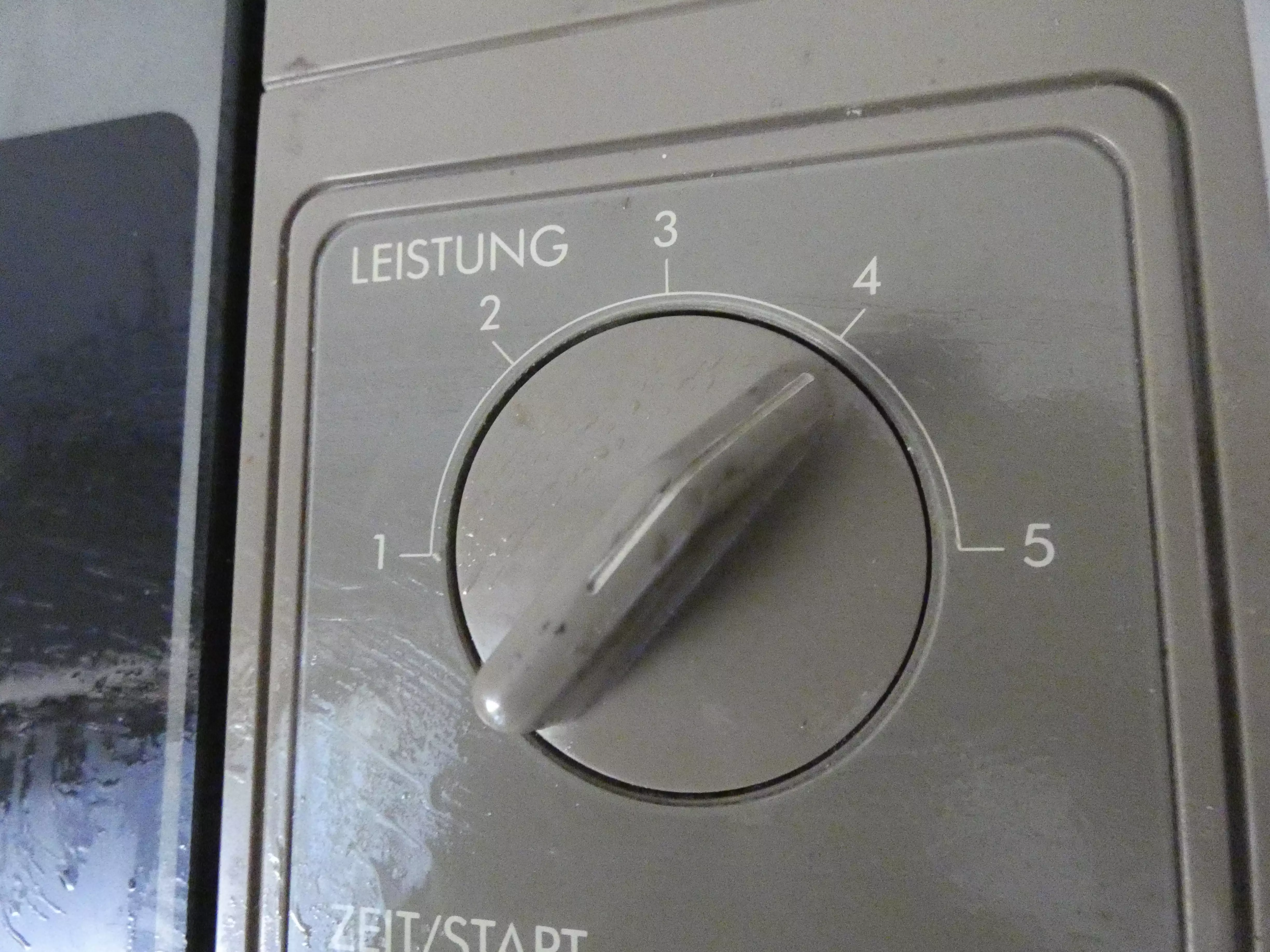
Detail shot of the power dial
They were intuitive: more clockwise, more power/time.
— The Guardian, talking about microwave dials
Yes rotary knobs are intuitive, but this leaves open the ‘Why’ and understates the ‘Intuitive’. Let’s start there.
Obviously, the time dial is about - time. And time, as it turns out, is very very circular. Poke a stick into the ground and watch its shadow move in a circle. Hell, watch the sun itself wander. Time feels circular.

A garden sundial demonstrating the intuitive way of representing time, courtesy of Wikipedia
Representing time of day in any other gestalt than a circle will always feel weird. Thus, rotary knobs are a good solution here. But there is another advantage, one that translates to the power setting as well:
A labeled rotary knob is one of the few interfaces where the element you use to manipulate the state is also the element showing the state. That may sound like the natural order of things, but is actually most rare: The light switch (state manipulator) is far away from the light bulb (state communicator). Gas pedal and speedometer are separate. The AC temperature setting is next to the temperature display, at best.
Often, this separation is for a good reason - I am not proposing that we make the speedo needle some kind of lever to control the car speed. 1 However, interfaces that manage to do away with the separation of manipulator and communicator are incredibly, incredibly intuitive. Here are a few more:
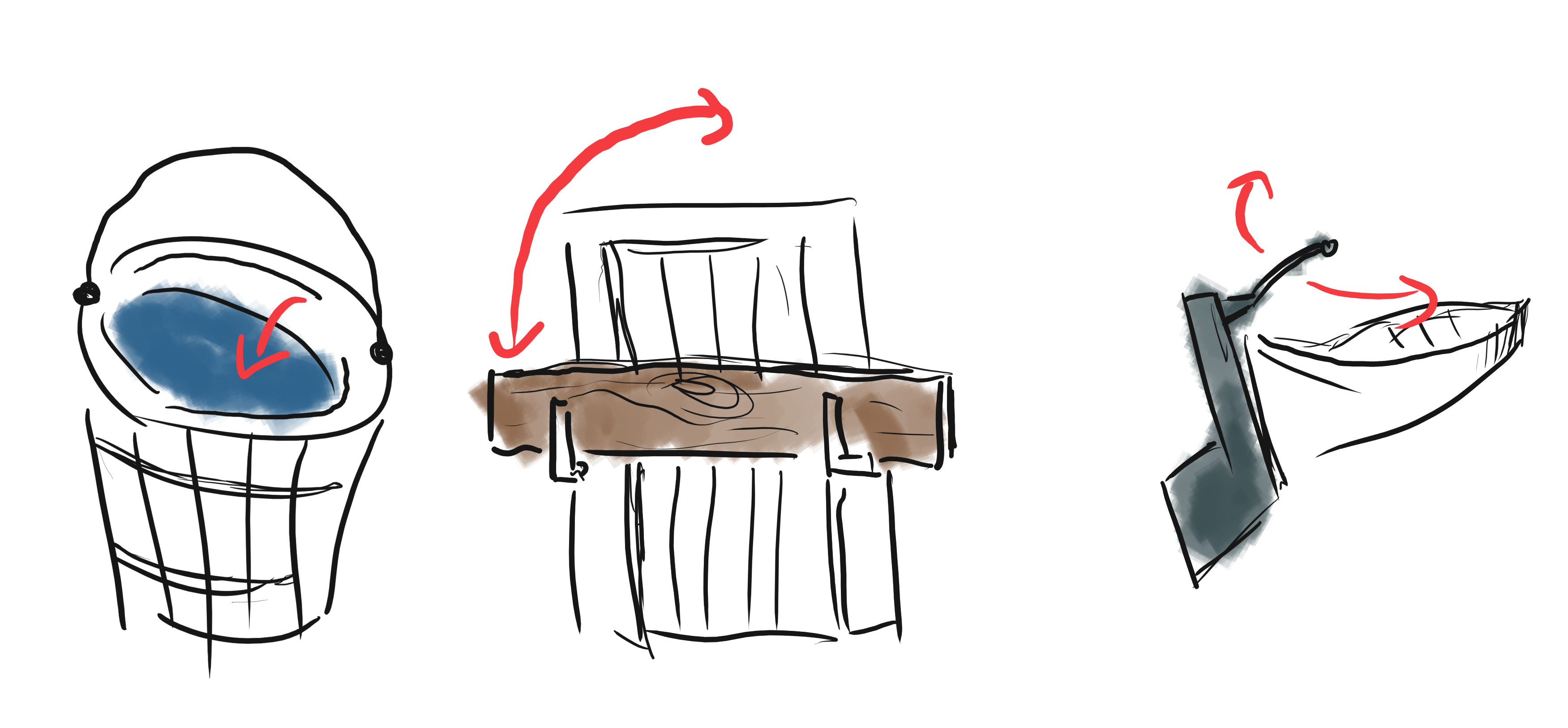
A water bucket, a rudimentary door lock and a rudder
The water level in the bucket is what you manipulate and also the thing showing you how much water you have. A plank in front of the door is either there or not there (a binary state, if you will) and is also the thing you touch to adapt the accessibility setting of your door. And so on.
Now you might find it a little grotesque calling the above examples interfaces and to be fair, they probably predate both the word “interface” as well as the English language itself. Nonetheless, everyone understands them immediately, automatically and forever. This is the genius of the rotary knob.
Complexity control
We can’t predict the exact user interactions and their order. At any point in time, our app may be in one of a mind-boggling number of possible states. We do our best to make the result predictable and limited by our design.
— Dan Abramov, The Elements of UI Engineering
Here is a number of “interactions” that are so trivial and obvious on my Lunik 601 that it feels weird to even discuss them:
| Situation | Concrete Intention | Solution |
|---|---|---|
| You’re hungry and the food is probably warm | Stop heating and get food out | Turn the dial to 0, press “Door” |
| Forgot to poke holes in the lid of the packaging | Pause temporarily | Press “Door” top open and then slam door shut when done |
| Hot chocolate is bubbling aggressively, causing overflow | Turn the power level down without pausing or resetting timer | Well, turn the power level dial |
| You remembered the preparation time wrong | Reduce cooking time by two minutes | Turn the dial counter clockwise by about two ticks |
| Late for your theater reservation | Explain your babysitter how to work the microwave in two minutes | Hardly required |
Now, an exercise for the reader - go through the above tasks with any of these microwaves:
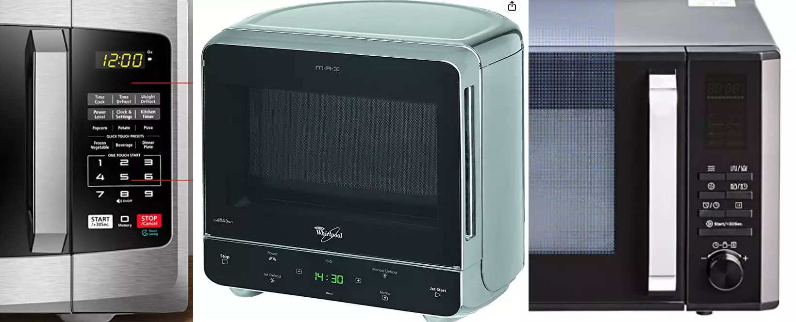
Randomly selected ‘modern’ microwaves, courtesy of Amazon
Due to the superior interface elements, the 601 manages to dodge the hardly controllable, explosive complexity of most UIs. There is no edge case left on the platform, probably no state combination at all that wasn’t automatically tested by using the oven a few times. That is as valuable as it is rare.
Emotional design
Usable designs are not necessarily enjoyable to use.
— Don Norman, Emotional Design.
Transcending its pragmatic and engineer-y approach, the Lunik 601 is also a joy to use.
First, we like big and heavy things. They feel important, trustworthy, solid. That sounds like vague hogwash and is also the reason why pedestrian fatality is going up for the first time since 1980. Of course every microwave oven is fairly heavy, courtesy of the transformer. But the 601 does not hide it, it embraces it. Every dial, every button is fat. Nothing about it looks petite. Why would it; it’s a serious tool!

Jeremy Clarkson on the appeal of heavy things, courtesy of The Grand Tour
Owing to this, the dials and more importantly the door also feel stable - inviting you to slam it, upon which it takes no offense. Closing it produces a saturated, mechanical sound which tells you “Stand back. Important work will now commence” before kicking into gear with the iconic hum.
Upon finishing, the Lunik produces a single, satisfying binggg. Analog sound, of course. While ‘modern’ microwave ovens mostly prefer a mixture of discordance, persistent repetition and overmodulation in their sound design, I actually look forward to the polite announcement of mine. Never have I felt any desire to peruse the 535.000 Google results for ‘how to turn off microwave beep’.
The little things
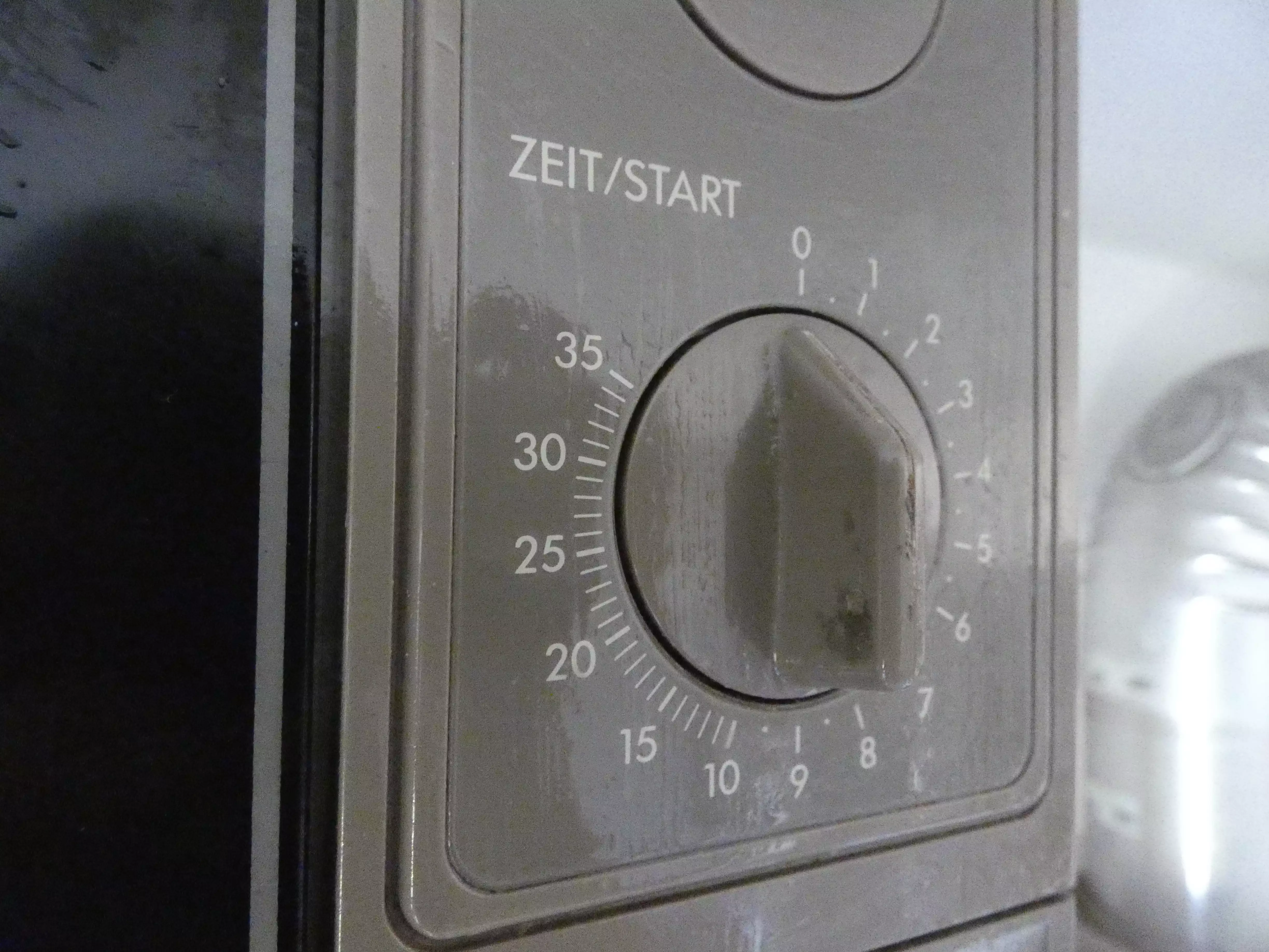
Detail shot of the time dial
There are several other aspects worth mentioning: The time and power settings are exactly as granular as you need them. Once you get over ten minutes, accuracy is traded for space. I would be fairly surprised if anyone ever had a valid need to set exact seconds on a microwave oven for personal use, and this one actually respects this fact. I actually used every single power setting, and never missed another.
The “Door” button conveniently both stops the heating and automatically opens the door a smidge, like the driver of an expensive taxi. Every surface is easy to clean, including the removable turntable.
Yes, it is labeled in German only, but I would argue that this appliance is easily understood by most everyone and usable even with visual impairments (or without looking) as well as shaky hands. Which is a decently sized win when designing a device intended to be this ubiquitous.
What could be improved
It’s not perfect of course, just fairly close.
My dear 601 is very big and very heavy. A product of its time of course - but still, that is a disadvantage. While we’re at it, the color scheme reminiscent of Snow White Design Language hasn’t aged terribly well, either.
Also it leaks radiation like a sieve 2. I can scientifically validate this by going near it with any kind of wireless headphones, upon which it starts generating a very convincing and loud ASMR track, missing only the sexually suggestive video. That’s not dangerous, but annoying (and probably doesn’t help your marketing team again the conspiracy theories).
Furthermore I would internationalize it a little. Braille or at least relief font would not hurt, especially for the numbers. Maybe add wattage labels to the power levels as it is now customary in recipes.
At last, the power level explanation lives a little far off from the actual power setting. That is not too bad, since it is more of an occasionally consulted guide than a primary interaction element, but still, it requires an unnecessary amount of mapping.
But that’s about it, really.
What do we learn from all this?
Glad you ask.
It would be inviting to conclude that UX belongs firmly in the Creative World’s Bullshit Industrial Complex since engineers had all this user interface stuff figured out long ago. But basic, analog design does not always work out and the world of user interaction was not all rosy before UX was invented. The embarrassingly high death count before we figured out that fire exits should open to the outside can attest to that.
Certainly, we can take away that great UX does matter - whether brewed by a UX designer or not. It makes weird people write invested blog posts about your brand which does not exist anymore. More importantly, when you take a problem which you identified correctly and solve it and then go and do not create other problems, it also makes people not write angry forum posts about your brand. You see, there are certain things that are tied to identity, style, social standing, ego, adventure, youth, memories or comfort to a level that will make people see beyond faults and even make weird statements like ‘i love its flaws’. Phones, cars, houses, artist’s tools, jobs. Maybe even spouses. However, microwaves of people who are not serious cooks are certainly not in this category. A microwave just has to do its job and not annoy.
The best interface is one where you can forget it exists.
— I forgot who said this and Google is useless
Maybe the lesson is minimalism? But then again I don’t think the designers of the Lunik 601 microwave oven were going for minimalism. I have no idea who they are (or when or where), but given that a whole generation of microwaves looks like this, I don’t think they were making some essentialistic statement, iPod-style.
Perhaps the lesson is just to keep an open mind. An open mind to the fact that just because an LED screen on Alibaba costs $2, it doesn’t have to be on and in every device. An open mind to the fact that old solutions may still be very good, and new does not mean better every time. And of course to the fact that some of today’s microwave ovens still look and feel pleasant to operate.
But shockingly this is not turning into a product placement, so I won’t link any and keep my Lunik 601 for now. Thanks for reading!
Footnotes
-
The single pedal in a Tesla 3 arguably does this, interestingly enough. ↩
-
‘Sieve’ is a very apt literary device here, because the window of a microwave oven literally is one: The dot pattern lets light rays pass (so you can see) but blocks most microwave rays, just like a colander lets through almost all water and almost none of the spaghetti. My Lunik 601 still leaks an unholy amount of radiation, though. ↩