Color. On of the most fundamental aspects of designing anything, and for good reason. Web design is no exception here. Of course, the web is quite old, and so is research on colors in the web.
Hall and Hanna wrote a quite avantgarde paper on this - in 2004. So, what are their recommendations for your website’s colors scheme?
The study
First: They generally care for two dimensions: readability and aesthetics. Interestingly, they measure readability both subjectively and objectively. It seems somewhat silly to me to literally ask ‘how readable is this?’, but that begs the question of what a good measure would be, then. Their approach to measuring it by retention (of the contents of the text which’s readability is in question) is quite sensible, I think. However sadly not significant in this example.
Let’s leave this aside aside and take a look at the core learnings from The impact of web page text-background colour combinations on readability, retention, aesthetics and behavioural intention. The study does not actually include the designs that they tested and in any case, what they are describing is quite a different web than that of today. I’ll use that as an excuse to gloss over most of the detail and just summarize their conclusion. The most fascinating aspect for me here is the fundamentally different paradigms of web design that shine through.
Results & conclusion
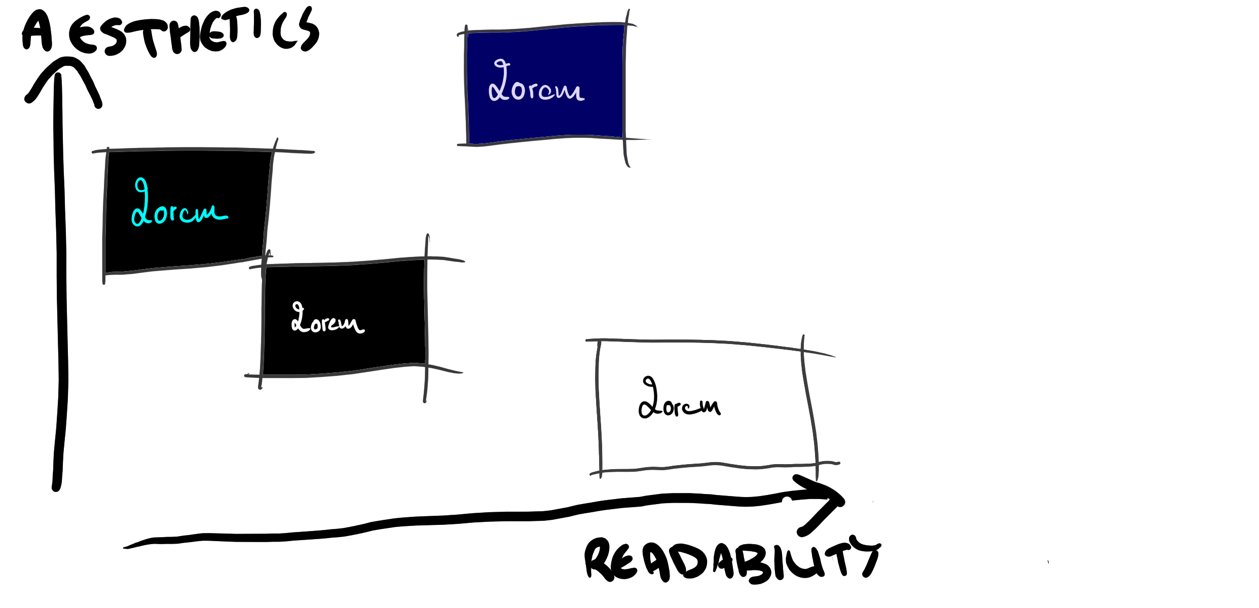
An important note first: A 2004 website is mostly text. Thus, what the authors test is background color and text color. Not the subtle brand colors one might put as a border-bottom on the header of a site today. A slap of color for the background and a color code for the couple hundred words of text, done.
Based on past research on color preference, context and readability they chose four color combinations, which rank as follows (first color is font, second is background):
- Readability (on a sales website): black/white > light blue/dark blue > white/black > cyan/black
- Aesthetics: light blue/dark blue > cyan/black > white/black > black/white
Quite wild results! Honestly, since I am not actually too knowledgeable regarding the state of the art research on colors in the web…I will just leave it at this.
Thanks for reading! This post is part of my series of reading and summarizing papers, mostly relating to UX. I use a casual tone, because that’s the most fun to me. That means my interpretation of a given paper may be off. Or incomplete. Or plain wrong. Always think for yourself, and for the love of God, don’t cite this in an academic context. Use the original article instead. Cheers!