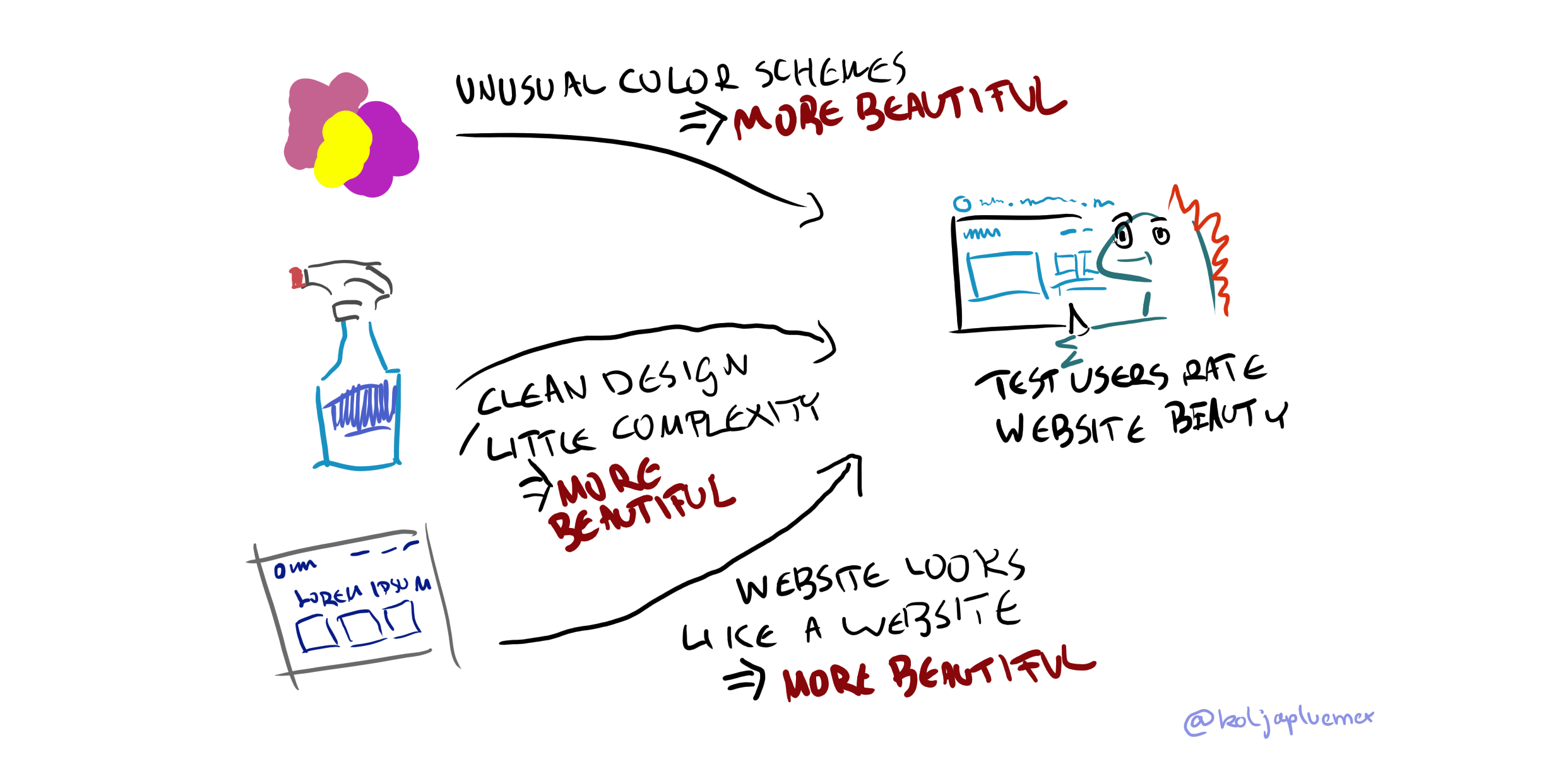
According to this, Simple Beauty: The impact of visual complexity, prototypicality and color typicality on aesthetic perception in initial impression of websites. is one of the five papers every UX designer should read. High praise! Let’s read it, then.

Summary
Basics
As I understand it, the author bases their research on the following four core terms. Oh by the way, we are only talking websites here. 2012’s websites, anyways.
Visual Complexity
How complex does a website look? Definition does not have to go much deeper, since this is just judged by test users in a prior study.
Prototypicality
How much a thing looks like a typical thing out of its category. How much of a tree is this tree? In this case, the category is something like ‘business website’.
Color Scheme
Well.
Perceived Beauty
How good does the site look? Rated by users, binary, like on Rotten Tomatoes.
Findings
The study was split in two parts. In the first part, they researched the relationship between prototypicality, complexity and beauty. Highlights:
- Beauty is judged really, really fast. 17 milliseconds is quite enough (side note: They used offline screenshots in the lab study. Your 3MB of js are not going to load in 17ms, of course)
- Less complex, more beautiful
- More prototypical, more beautiful
- Comparitively, complexity matters faster than prototypicality in regards to beauty perception
The second part introduced color into the mix. The core finding was this:
- Unusual color schemes yield read higher beauty ratings, contrary to the hypothesis of the study
Potential Problems
Some things to consider:
- The study is ten years old at this point, and man, web design moves fast. Primal mechanisms of human color perception probably does not, but the age might invalidate practial advice from this study.
- Binary ratings (complex/not complex) instead of numeric ratings introduce courseness and unpleasant bucket effects.
- Aesthetic Perception is not Click Through Rate or Brand Trust. The study does not claim otherwise, but I think that should be mentioned. Maybe you don’t even want a beautiful page, who knows.
Disclaimer
This post, being a summary, is really not long enough to warrant a TLDR. Instead, here is a disclaimer. The casual tone of this article means that some accuracy may be lost. Also, this is my own interpretation, which may of course be incorrect, incomplete or plain wrong. Here is the Full Text of the article. Cheerz!